Clara Pensions
– Branding
– Visual identity system
– Website design and development
– Marketing collateral roll-out
– Branding
– Visual identity system
– Website design and development
– Marketing collateral roll-out
Client Overview
Clara is the UK’s first and only pension superfund approved by The Pensions Regulator. They offer a safer, more secure way to manage and protect defined benefit pension schemes, providing greater certainty for both members and trustees. By bridging the gap between traditional schemes and insurers, Clara helps ensure long-term financial security for pension members.
We partnered with Clara to refresh their brand identity and enhance their digital presence, ensuring both reflected the strength of their reputation and their clear, member-focused values.
The Brief
Clara approached us to refresh their brand identity and redesign their website to better reflect their position as the market’s leading, regulated pension superfund. The updated brand and digital presence would support several key strategic goals:
Reinforce regulatory credibility: As the UK’s first approved superfund, Clara needed a brand and website that conveyed authority, trust, and financial security.
Humanise pensions communications: Recognising that pensions can feel complex and impersonal, Clara wanted to bring a more relatable, human perspective to their brand.
Modernise and stand out: In a traditionally conservative sector, Clara sought a forward-thinking, professional identity to clearly differentiate themselves.
Support growth and engagement: With plans to scale and welcome new schemes, an intuitive, polished website would help explain Clara’s model, build confidence, and reassure members.

Branding
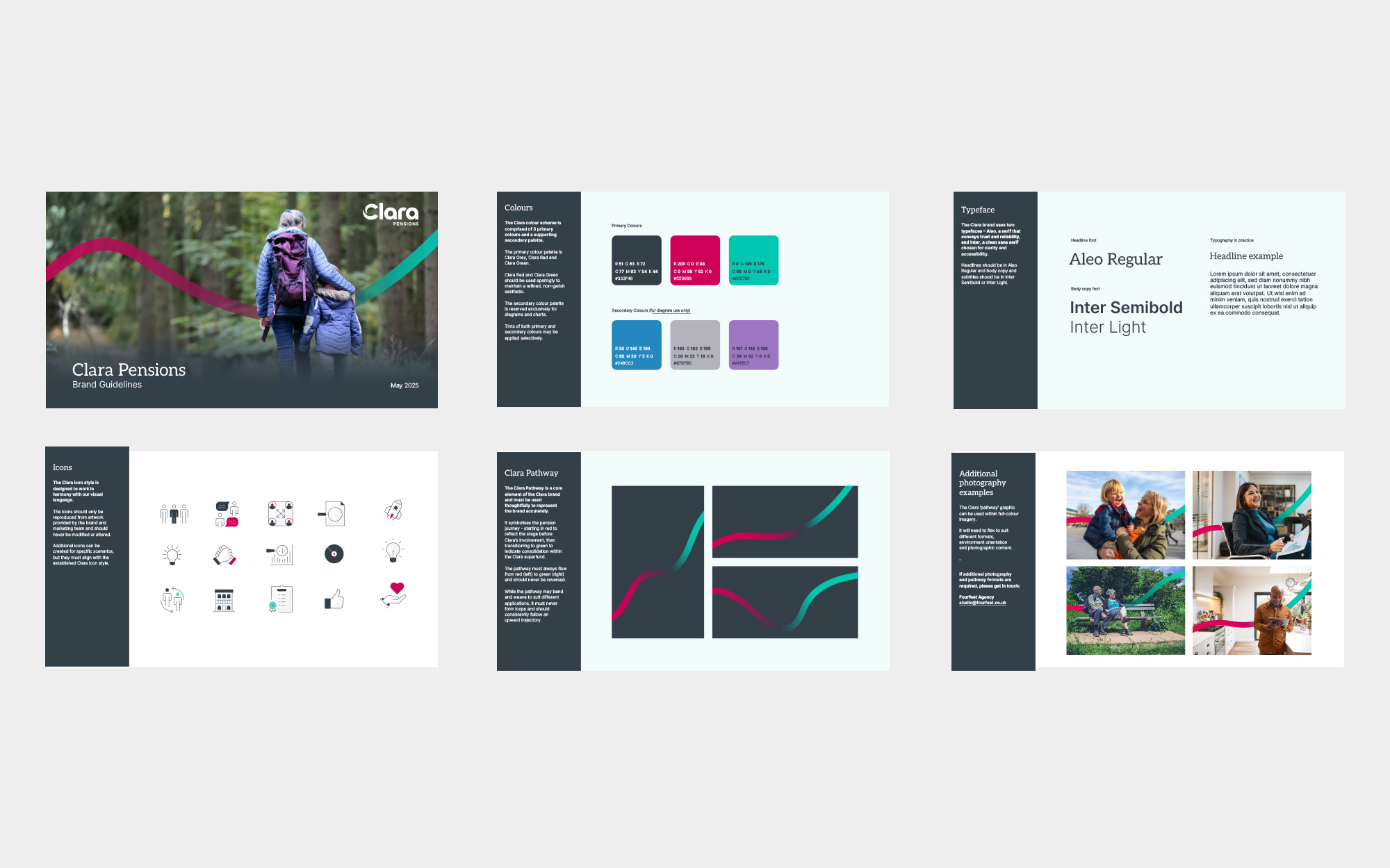
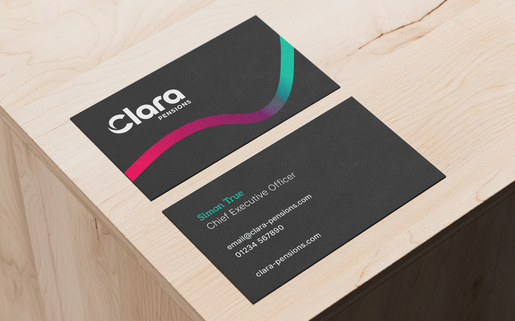
The new Clara Pensions brand is deliberately understated yet confident, reflecting their role as a safe harbour for pension schemes. The visual identity system leans heavily on clarity, simplicity, and professional reassurance.
While retaining some elements of Clara’s former visual identity, we refined how these were employed to create a cleaner, more consistent, and professional look across all touchpoints.
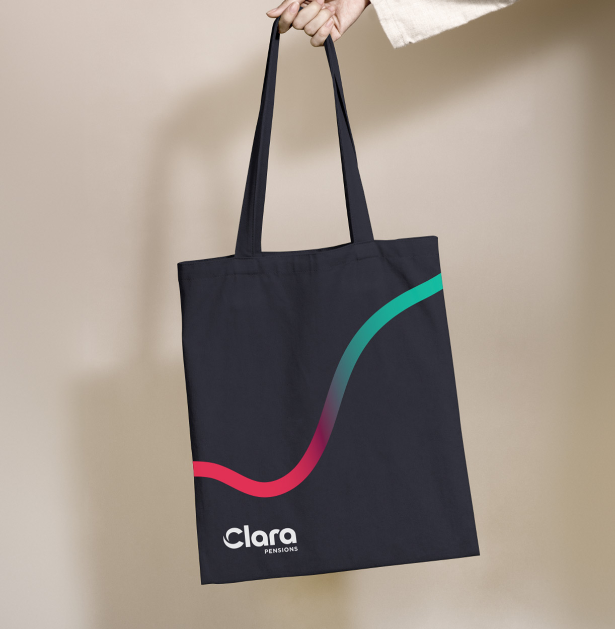
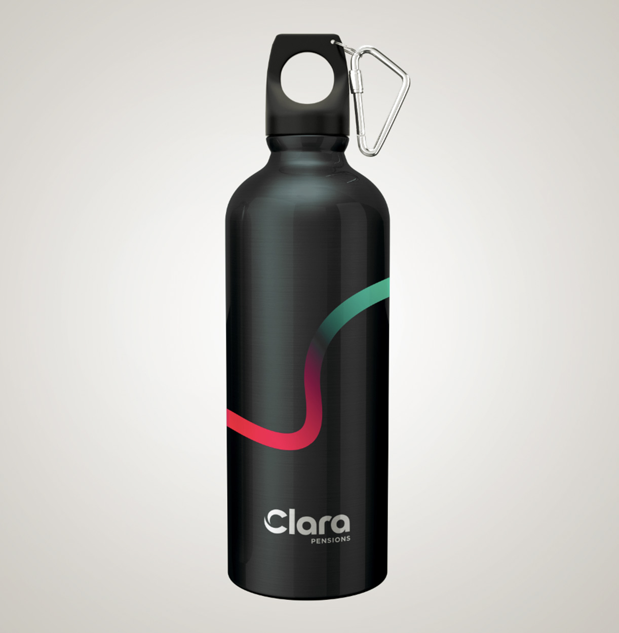
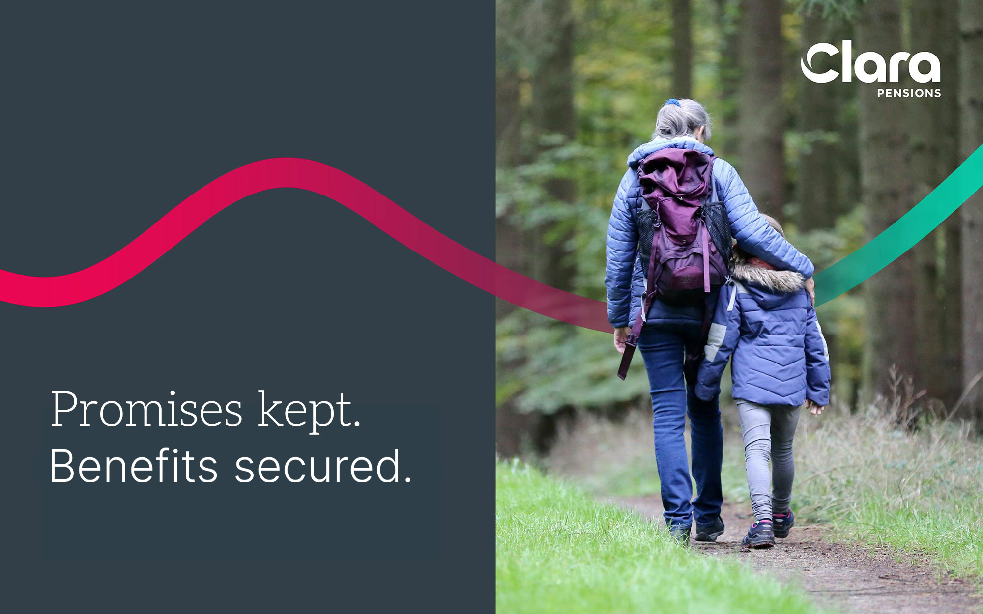
A new graphic device – the ‘Clara Pathway’ – was introduced to help with storytelling and to visually represent the pension journey towards buyout. The pathway moves from red, symbolising a degree of complexity and uncertainty, to green, reflecting the clarity, control, and security that Clara brings to the process.
Photography played a central role in the rebrand. By showcasing diverse, everyday people through warm and reassuring imagery, we made the Clara Pensions brand feel more personal, relatable, and approachable.
To ensure the imagery and tone of voice worked in harmony, we partnered with copywriter Richard Marsden to develop clear, empathetic, and jargon-free language. This helped make complex pension consolidation processes simple and accessible, while reinforcing themes of reassurance, future security, and responsible care. Richard was brought on from the outset to help define the core Clara brand architecture.
Website Design and Development
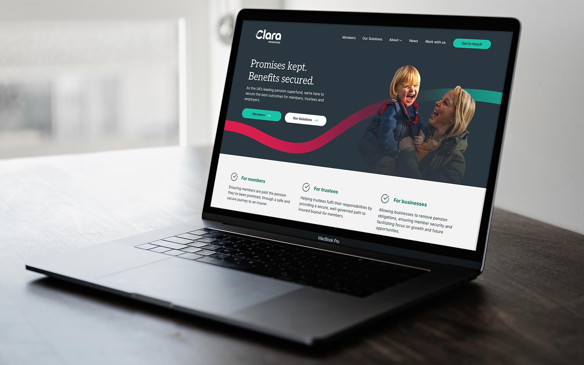
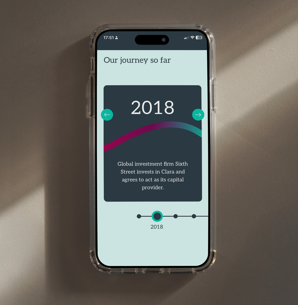
As part of the brand transformation, we designed and built a new website, creating a dynamic, secure, and user-friendly platform. The new site was carefully structured to ensure users could quickly and easily find the information most relevant to them, with tailored sections for members, trustees, and advisers.
Key improvements include:
– A clear, refined content structure tailored to each user group
– A clean, contemporary design system
– Robust security features and full accessibility compliance
– An intuitive, flexible CMS, for ease of regular updating
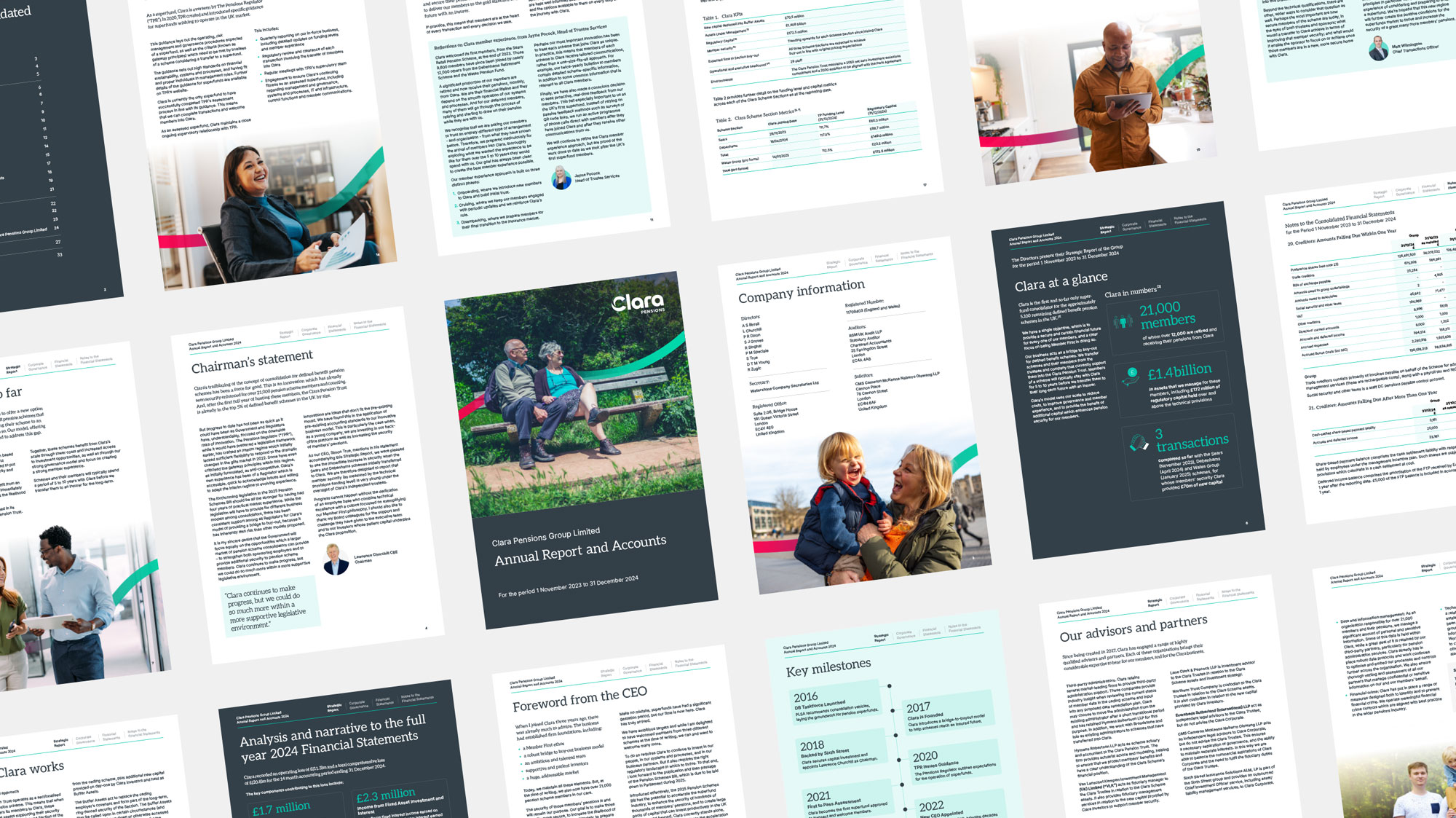
The website launched alongside Clara’s latest Annual Report, providing a confident, modern digital presence that better reflects their authority, values, and future ambitions.
Outcome
Clara’s refreshed brand and website now clearly express who they are: an experienced, trustworthy organisation with an unwavering commitment to members.
The rebrand has sharpened their market positioning, reinforced their leadership status as the UK’s first regulated superfund, and provided a strong, future-ready platform for communications and growth.
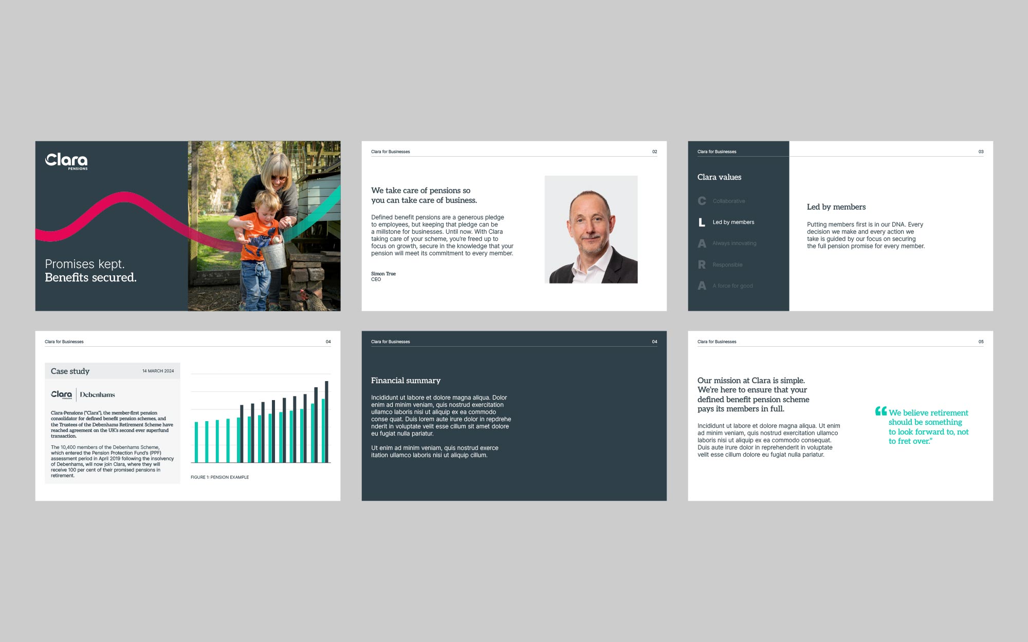
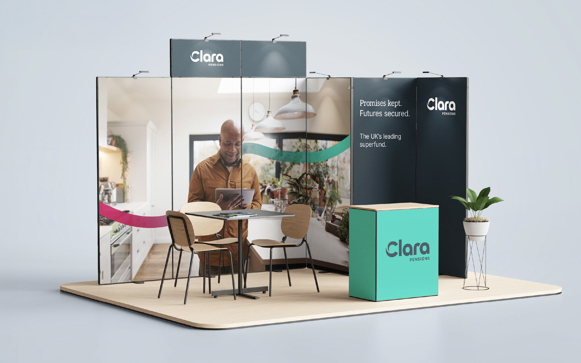
As Clara’s retained creative partner, we’re excited to continue supporting them in rolling out the new identity cohesively – ensuring clarity, consistency, and impact at every stage.
“I felt the team at Fourfeet really took the time to get to know us and our business. This shone through in their branding work and the website design and build, where it’s evident that they listened, challenged, and applied a sense of pragmatism where necessary to deliver a great result.
Our new brand and website are clear, easy to navigate, and convey a real sense of what Clara is all about. Overall, the process has been straightforward, and the support from the Fourfeet team has been excellent. I have no hesitation in recommending them.”
Rebecca Wainwright
Chief Operating Officer